 We here at We Talk Wrestling and We Talk Podcasts are putting word out that we are accepting guest blogs and podcasts to be part of the We Talk Family. You’ve already seen a few of these on the site and we\re happy to show you the next part as Rich AKA FreaXTVChannelE contacted us about some of the ideas presented in WWE making the bold move of cancelling RAW and presenting a new show in that time slot.
As we work with him to develop as new flagship Monday night show we thought we’d give you a little primer of what you can expect over the next few days with the reboot he did earlier on TNA.
FreaXTVChannelE is a real talented guy and we’re very excited to have him on board. I’m sure you’ll all love his upcoming work but you can check out more of him at his site http://fxtve-rebooted.blogspot.ca/ or at Twitter @FreaXTVChannelE
Mo
TNA #REBOOTED Section01- Logos with Impact
Welcome to the first in a series of Laced Up & Rebooted sections, covering the Total Non-Stop Action Wrestling company that is TNA and Impact Wrestling.
TNA Impact Wrestling
Ever since TNA first caught my eye on the Impact shows and PPVs, back in 2005, with its spectacular highflying X-Division, fast paced matches and brutal hardcore action, I’ve been an avid follower and big fan of the show.
When I first tuned in, I was amazed by the sheer wrestling abilities of these new wrestlers such as AJ Styles, Samoa Joe, Chris Sabin and many others, plus the spectacle of the six-sided-ring, adding further intrigue to this new and exciting wrestling show.
Over the years, with various production and roster changes, there have been many high points as well as lows, but overall I believe that as a growing company, TNA have contributed some impressive and lasting achievements to the industry, giving healthy competition to the overall scene.
And despite some of the obvious flaws within TNA, when it comes to the actual wrestling and in-ring action, with one of the best rosters of talent in the business, TNA has a real knack of delivering some of the greatest quality Wrestling seen on TV.
The Marketing Machine
Now as a fan of a number of wrestling companies over the years, I have to agree that the WWE still manages to far outweigh the competition when it comes to Marketing their product. Whether it be Presentation, Advertising or good old-fashioned Hype, it’s a huge and daunting task for any company, wrestling or otherwise, to compete on the level of the big WWE Machine.
And this is where I believe TNA really need to concentrate all of their energies towards, in order to compete and survive as a top contender to the No1 Wrestling Company.
Mission Statement
So what I’m aiming to achieve in these TNA sections is- Taking props and experience as a designer in producing new concepts and ideas for products, hypothetically speaking, if I was given the design brief to build up the marketing side of TNA; presenting the production package of the company from the ground up, well this is how I would go about doing it…
1.1 Logos
Starting with the design basics at the front-end of the Impact Show product, I’m going to cover the main Logos.
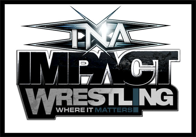
Now the first point I’m going to make is with the show’s Title and the confusion with using both TNA and Impact Wrestling separately. To avoid this I’m simply going to combine the 2 together from here on in, to make it ‘TNA Impact Wrestling’. This Title will also be used when presenting Pay-Per-Views & Specials (see Section5).
Now as the Impact Wrestling Logo stands, I really like the font and new colour schemes, but I still think it could be a little bolder in style for the subject matter of an Action-based product.
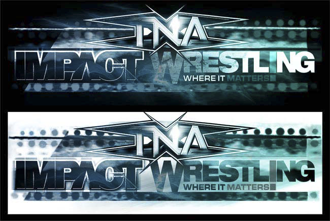
So with this in mind, here is my first redesigned version of the TNA Impact Wrestling Logo:
While keeping with the current Impact fonts, I’ve tried to give the Logo a more defined and solid approach, with a stronger outline and metallic finish to give it some weight. I’ve used the old TNA design (out of preference to the new 1), just adding gloss and a few more spikes.
As for the Tagline, which in it’s current state reads ‘Where Wrestling Matters’, I’ve cut this down and incorporated it into the ‘Wrestling’ type to now just read, ‘Where It Matters’- A little snappier and less laboured I’d say.
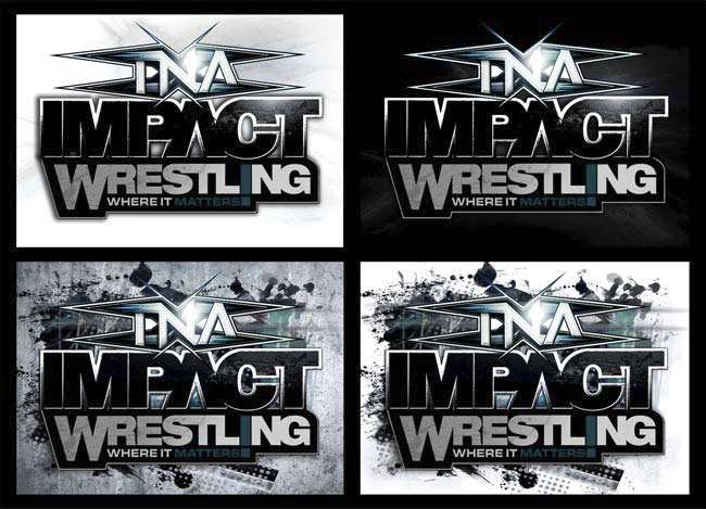
Here’re a few more examples of the Logo against a variety of backgrounds:
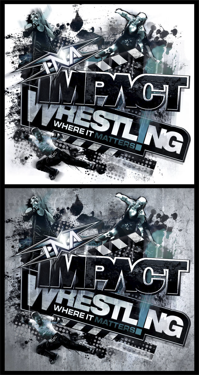
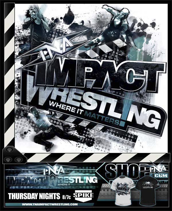
Now to present the Logo as a Cover for DVDs and Posters etc, I’ve brought in some extra elements to create a combined wrestling feel, with movement and dynamics to make for an action-packed feel to the product:
To break the design down; I’ve used the movie Clapper-board B&W stripes to signify ‘Action’ (a theme implemented into other areas of the show) along with current wresters from the roster to instantly define a wrestling theme.
This Design will also be used as the main Titles to the show (see Section2).
Here’s another variation on the Logo design, when used as a horizontal banner for the Ring skirt or on widescreen monitors. I’ve kept with the main logo elements, just moved them around to make the fit, while adding some extra lighting and smoke effects:
This Design will come into play further on in this section.
So to round up the new Logos, with examples for merchandise, here’re the new TNA Impact Wrestling T-shirts:
Now to further expand on all the Design elements so far, I’ve put together a Cover to advertise the whole Impact show, giving programme information, websites and examples of the merchandise, all rolled into one:
The Clapper-board design, used here to advertise the TV show and ShopTNA, could also be utilised as a Display feature within the show, highlighting individual Wrestler Info & Stats to accompany Entrances.
So while this rounds up the main Front-End Graphics to the TNA product, it’s time to take all of the pieces and apply them to the Impact Zone, to further illustrate how the logos will interact with the show’s layouts.
But before I get to this, there’s just one more issue I have to address:
1.2 The Six-Sided Ring
Now this debate may be more down to personal opinion between fans, but as a Marketing tool I really think the 6-Sided-Ring defined the company with a solid Identity, as well as making it unique to any other wrestling product on the market.
And a Unique dynamic angle to the product can only be a good thing, right?
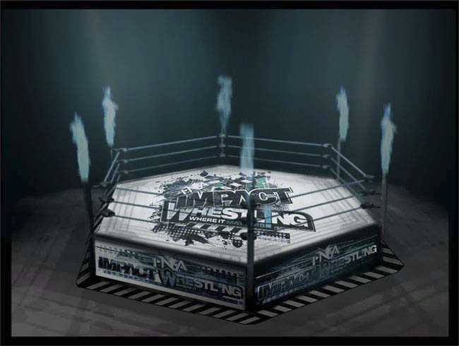
So for this reason and the fact that it was such a major factor in attracting my attention to the show in the first place, I’m going to bring back the 6-Sided-Ring:
I’ve used a stripped down version of the title logo in the centre of the canvas, which I just feel adds to the overall ring design, while the horizontal banners cover the skirt, advertising the company information. I’ve also added the B&W stripes around the edges to tie in the elements from the posters and enhance the overall design.
1.3 The Impact Zone
Another issue of TNA over the years has been the venue where most of the events have taken place; the Impact Zone. And while I understand that as a new company with tight budgets, it’s not often possible to deliver stadium shows on a regular basis, it still would be nice to have a venue that could hold more fans, giving a larger presence and atmosphere to the show.
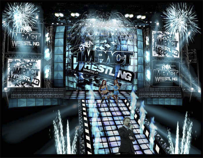
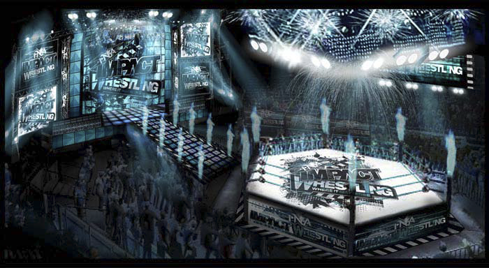
Though given the limitations of the current Impact Zone, I’ve made some alterations to tie-in the themes of the Logos, Designs and Colour schemes, while attempting to give the show a grander appearance, with larger Screens, Lighting-rigs and a more impressive Entrance-Ramp:
While I’ll cover this part in more detail in Section2, the scenario here is how I envision part of the Opening Sequence to the Impact Show.
Now to give a larger view of the Impact Zone, with all the props and design elements in place:
And to top off this section with a final look at the Impact Zone in action, it’s time to bring in the TNA Wrestlers and get this show started:
TNA, TNA, TNA!!!
So that concludes the first Section of this whole TNA Reboot. And to further cover and tie-in the TNA Impact Wrestling house shows, the next Section will cover the Titles Sequence to the Weekly Impact show. See you there!



[…] and we’ll see what works out, meantime enjoy the talented FreaXTVChannelE work and check out part 1, and see more at his site http://fxtve-rebooted.blogspot.ca/ or at Twitter […]