We continue to post the TNA graphic Reboot from @FreaXTVChannelE website in preparation for his take on what he would do with a new WWE Monday Night Supershow. Previous parts available in the archives so check them here if you’ve missed them and enjoy
TNA #REBOOTED Section04 – Makeovers & Takeovers Pt2- TagTeams
For this Makeover edition of Rebooted I’ll be covering the Tagteams; a division in TNA that has really stood out as probably the best in the Wrestling Industry in recent years.
Now on completion of designing this Section, every Tagteam and member of each was still active in TNA, but due to recent roster changes, a number of these teams are no longer active at present. But since I’m booking these teams as a future concept (see Section5- PPVs) I’m staying firm to my choice, so hopefully we’ll see this lineup of Tagteams again sometime soon in TNA.
4.1 MotorCityMachineGuns
As a massive Fan of the Machineguns, this Tagteam for me has been the best ever in Wrestling period (IMO ok!). While treading water for years in TNA, they finally reached their ultimate potential when gaining the belts and feuding with BeerMoney, in a series of matches that really tipped the scales of Tagteam Greatness.
And while this team is no longer active in TNA, I’m sure we’ll be seeing a lot more of the MotorCityMachineGuns in the future.
As for the appearance and style of these guys, I wouldn’t change a thing, so for this Makeover I’m simply going to expand upon the package, with a new Logo and extra Elements to compliment the overall Presentation:
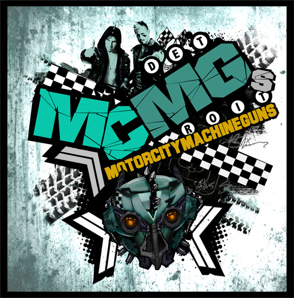
For the main Logo I’ve given a hint of a Nascar theme, with chequered strips and tire marks.
And as for the main MCMGs’ Icon, here’s introducing the Transformer nascar/robot known only as MachineHead. It would be great to incorporate the MachineHead character into the MCMG concept; maybe with a full scale model to appear in promos or incorporated into the entrance theme.
To present the whole Package, with the Wrestlers and Logos and a new team Tagline, here’s the Promo Poster:
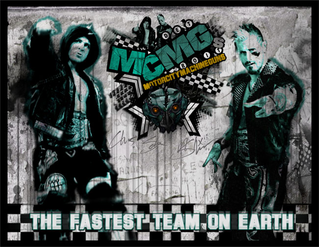
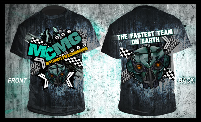
And to go with the ‘Greatest Wrestler’ tagline trend, ‘The Fastest Team on Earth’ I feel fits in nicely with this team.
So using all the Logos and Props for the MCMGs package so far, here’s the new T-shirt:
To add to the MCMGs theme even further and expand upon the Image and Hype, as well as the Lineup, here’s a Special Promotions Poster for the Next Generation of the Fastest Team on Earth and the Future of the MoterCityMachineGuns:
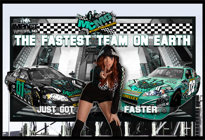
Now this setup I’d love to see; with the One Girl Revolution that is Taeler Hendrix and the MachineGuns together: A Dreamteam if ever there was one!
And unless you’ve been totally distracted by the foreground, you may have noticed the MCMG Nascars at either side. This is a theme I’d love to see played out at a huge PPV; Imagine the Guns driving down to ringside at BFG for their Big Future Return! (please let there be a MCMGs Future!!)
4.2 Joe & Magnus
The Tagteam of Samoa Joe and Magnus was one of those random and unlikely pairings that quite simply just worked, developing into one of the most impressive Teams of recent years.
As a unit, I really wanted to give this team a Combined theme to solidify their act (something I feel is often lacking in wrestling tagteams). So the team Name I’ve created here is simply a phrase commonly associated with Samoa Joe, combined with Magnus to read, ‘Joe and Magnus are gonna Kill you’- simplified and abbreviated into: JMRGKU.
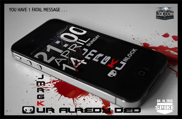
And with the new Name comes a new Deadly Image:
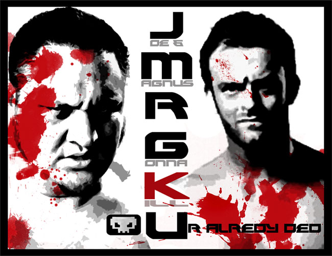
To fit with the Title, the whole Theme here is designed to play on the Hitman-style scenario, with this deadly Tagteam just a phonecall away from coming out to Clean House!
And with this next promo Poster and Video package, geared to spell out the message further, just pray you never get the call:
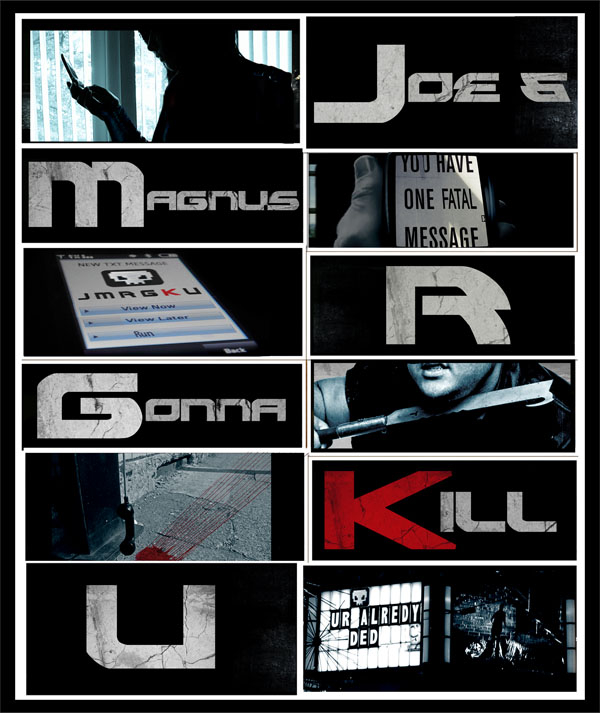
This idea works as a poster as well as a video clip, with each scenario acted out and cut between the captions. The Idea for the wording is that by the time your eye scrolls down the Title to the letter ‘U’, Ur alredy Ded! (text speak btw- Yes I can spell).
To accompany the Promo, here’s a more abstract pitch to display on Billboards and Posters, with a final warning to all opponents:
So, taking the Images and Logos of this deadly Tagteam, here’s the new JMRGKU T-shirt:
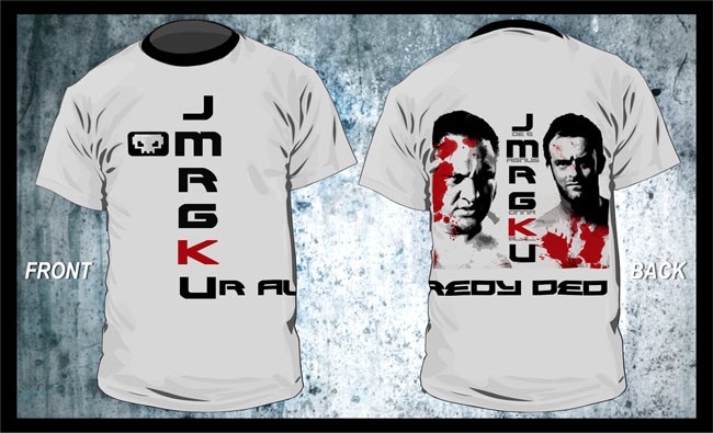
Now that’s killer Hard-Wear!
4.3 Daniels & Kazarian
Currently as the TNA Tagteam Champions (at the time of writing), this solid team have developed naturally since the fall of Fortune.
So to tie up a few themes and associations here, I’ve given this Tagteam the name, 2 Cents; The reason for this being on the theme of ‘Money’ in relation to ‘Fortune’, plus the common phrase of ‘my 2 cents’ when used with irony to express a strongly felt opinion- A term that I felt matched nicely with the opinionated attitude of this team.
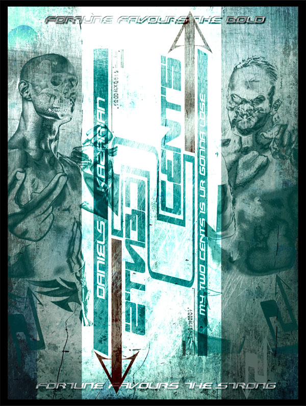
Here’s the new Logo and Backdrop for the team of 2 Cents:
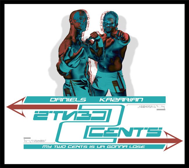
For this Logo I’ve given it a modern graphical edge to add more design to the stylish image of the 2Cents Tagteam, with elements taken from the Fortune logo to tie in the themes.
And combining the Images and Elements, here’s a Banner or Poster to promote the new look:
I think it would look great for 2Cents to make their entrance wearing the skull masks, to gain intimidation over their opponents and add more style to their opening appearance.
And on the subject of adding more Style, here is the new 2Cents T-shirts range:
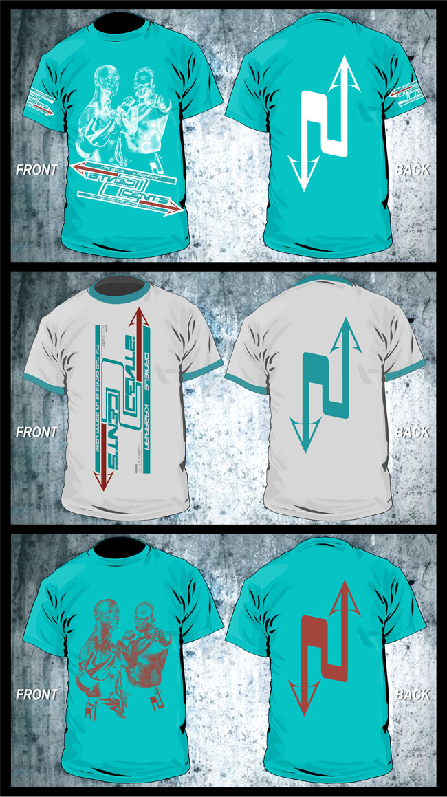
Even as Heels, I think a brighter, stylish approach like this could work, rather than the usual macabre images, and I’m sure the audience would be reluctantly swayed with this new 2Cents clothing range.
4.4 Crimson/Morgan
As a coherent Tagteam, Crimson and Morgan was a formidable force that very few teams could even compete with. But as a unit, these guys just couldn’t get along, so the inevitable happened as does in most situations in Tagteams, and they split up and feuded.
Now for this version of the Tagteam I’m going to take the feuding giants and keep them together. (The twist here being that as part of a storyline stipulation at a previous Sacrifice, as the losing team they must stay together or face the firing line)
So onto the Designs for Crimson and Morgan, starting with the Logos:
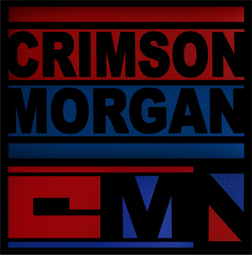
The Logos and Symbols represent the individual character colours, with Crimson in Red and Morgan in Blue, to instantly signify the opposite ends and a clash of personalities.
The Triangle Symbol runs through their designs.
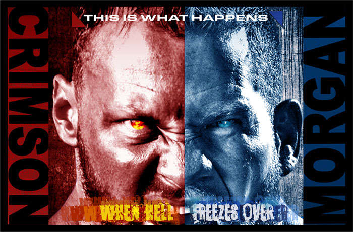
And for a Poster, Cover or Backdrop to the team, here’s the Promotional Image to add Fear into the Division:
To tie in and further enhance the colour scheme, I’ve used the theme of ‘Fire and Ice’ to show the power and strength of this formidable yet unbalanced duo.
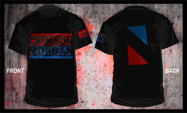
And using the simple graphic styles of the Logos and Symbols, here’s the new Crimson/Morgan T-shirt:
The T-shirt to wear for when Hell Freezes Over!
So that wraps up the Tagteams Section and the whole ‘Makeovers & Takeovers’ Sections for now.
I’ll try to add more to this if any new Teams develop in the coming months, though only if they’re any good (no Robbies in this Section thankyou!).
And I may come back to expand on more Makeover Sections in time, with the X-Division and Heavyweights.
But for now I hope you’ve enjoyed the ride so far, and stick around for the next instalment of Rebooted, with a Giant-Sized, In-depth look at the whole TNA Pay-Per-View Scene in Section05- ‘PPV’s & Supershows’. See you there!




What’s up i am kavin, its my first time to commenting anyplace, when i read this paragraph i thought i
could also create comment due to this brilliant post.